

SPEKL
P.O.P. Site Branding & Packaging for Refillable Makeup
I created a brand and designed an efficient use of space for a point of purchase site. I conceptualized the logo and developed a consistent yet versatile structure intended to be inviting and provide ease of access for all users.

brand identity
SPEKL is formulated from the concept of makeup compacts. Compacts are pressed powder into shallow tins. Since a significant variety of makeup products are powder based, it provides the versatility that our brand draws from. Powder is composed of tiny speckles of product, hence the name.

logo
The pictorial mark’s abstract shapes represent elements related to cosmetics ranging from eye shadow palettes to compacts and beyond.
SPEKL’s name is a variation of the word speckle with letters removed, but ensuring the word is recognizable. It captures the ideal of making the most from the least while maintaining an elevated, minimal product.
Letterforms from the typeface politica regular are adjusted around the logo square round shape. The edges are appropriately rounded and the horizontal bars are shifted to be level with the pictorial mark.
tagline
SPEKL aims to foster creativity, empowerment, and inclusivity through both our products and brand messaging. The tagline is purposely open to different individualized interpretations.
confidence in color


interchangeable
color palette
floor plan
Since the site is intended to be self-driven by the customers, the space is divided into stations that serve different purposes. Each section is intended to produce traffic flow for newcomers while still allowing returning customers to navigate directly to where they desire. It is ADA accessible at every stop.
touchscreen pillar
display shelf
packaging counter
lights
sculptural mirror
1
The four-sided touchscreen is where the product is ordered, mixed, refilled, and deposited.
2
The counter and drawers are
a space for buying the palettes and placing the makeup tins.
3
The sculpture has mirrors and cubby spaces for those who are eager to try the product.
4
The glass shelving wall is used as product display, but can be a social media attraction too.

LED lights help illuminate the space and generate an overall vibrant atmosphere.
traffic flow
First-time visitors would follow the stations as shown above, but the floor plan is open to allow returning customers to head directly to what suits them best.

Structures are spaced to allow freedom of navigation depending on need.
elevation
First-time visitors would follow the stations as shown above, but the floor plan is open to allow returning customers to head directly to what suits them best.

Each structure is accessible and maintains the square round form.
site overview
As a whole, the physical site is meant to grab the attention of passersby, but maintain an aesthetically pleasing outlook. The colors and structural forms retain the essence of the logo and brand to create a sense of unity that connects the stations.

The touchscreen has motion sensors to detect when people pass by.
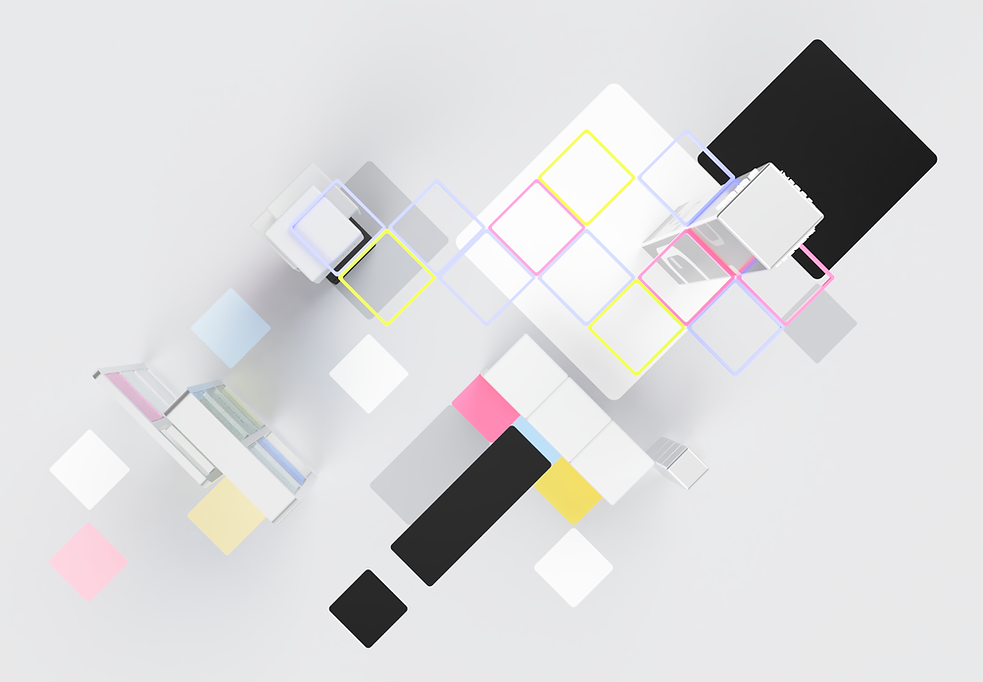
Floor graphics help guide through space as seen from aerial view.


All makeup product is bought and packed in this vending machine.

Anyone can wear makeup so the space must be accessible to all.

Colorful lights illuminate the space and attract attention from afar.

Purchased makeup tins can be easily transferred to the table for packaging.

Palettes come in 4 sizes and can be purchased and packed at this station.


The palettes accommodate for all SPEKL products, like this 3x3 (6").

The sculptural mirror has space to put belongings down while testing product.

Finish the experience with a picture of two in front of the split dimensional glass paned structure.